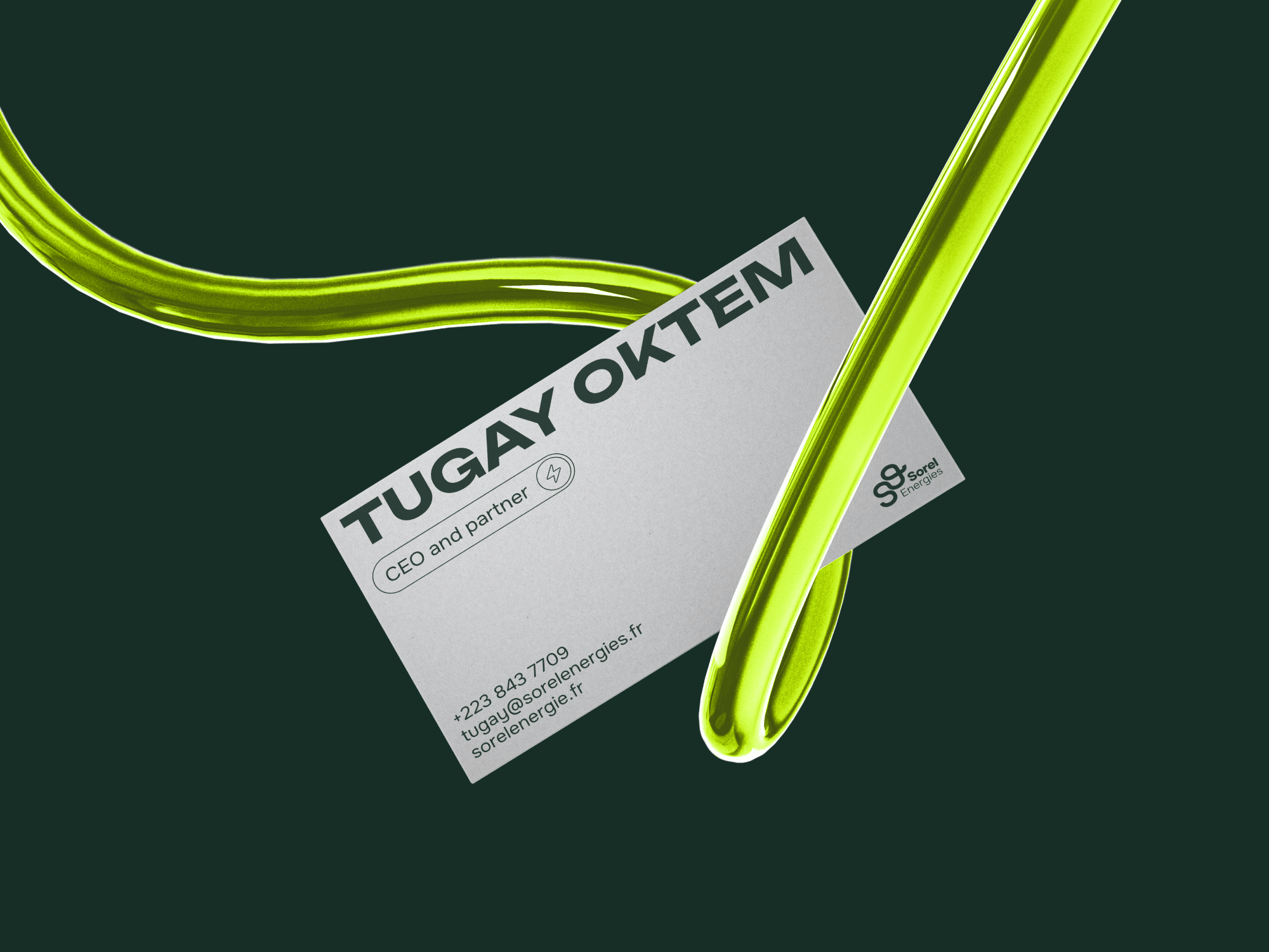
Creating a new visual identity to highlight their excellence and professionalism through a clean and clear bento layout. The logotype, inspired by the electric wire, forms the letters S and E of Sorel Energies and can be replicated to create a pattern with plugs for electric cars incorporated.
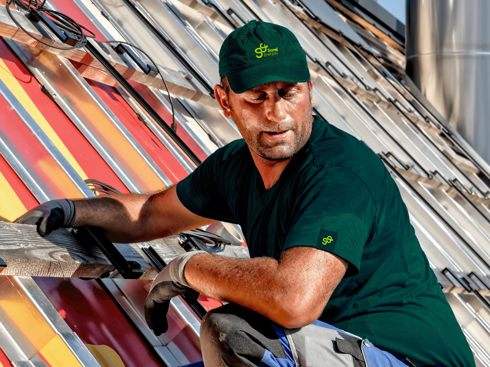
These connections symbolize Sorel Energies holistic solution, covering everything from the installation of solar panels to charging stations and batteries. A greener approach that enables energy independence for transport.
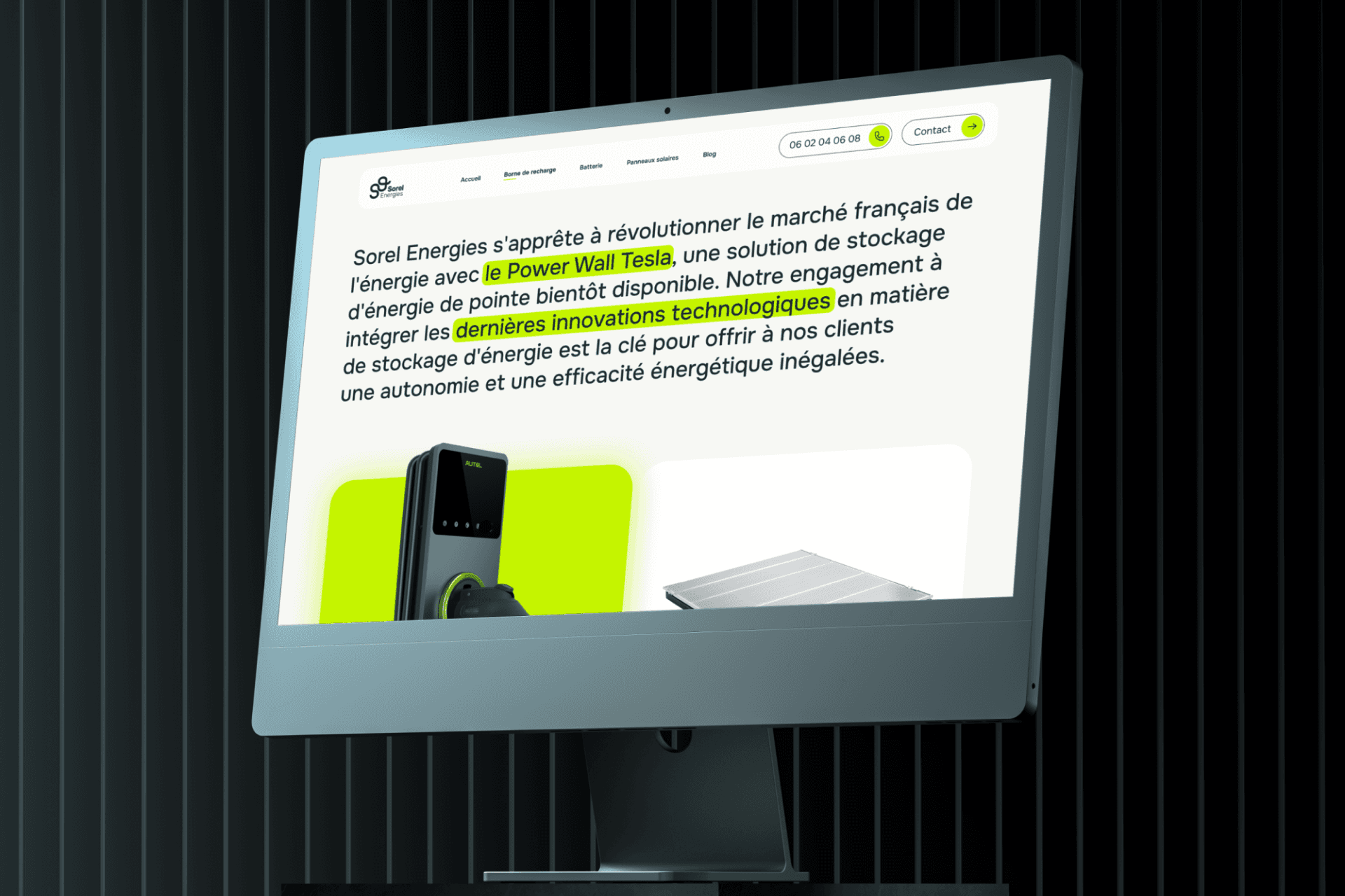
This new visual identity has been deployed on their new website, which we had the pleasure of designing.